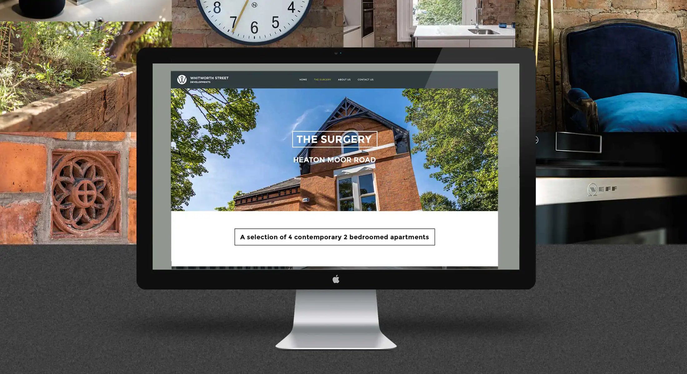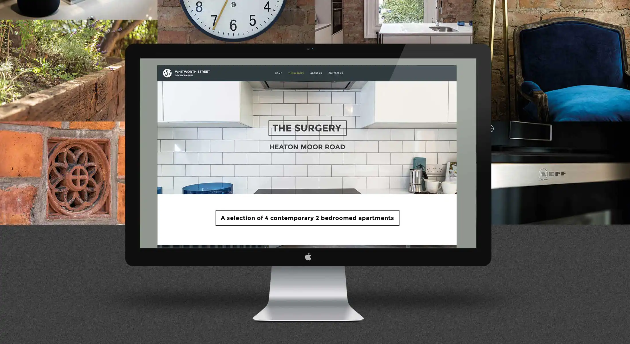
We were approached by Whitworth Street Developments at the beginning of their company launch to help with their brand identity and website build.
The ethos behind their brand, and point of difference, was to build and develop properties they would actually want to live in. They felt strongly about going the extra mile and not cutting back on material and fittings and the areas they chose.
A monogram with an architectural flourish and structural flow makes up the logo mark. Placed in a roundel; this almost gives the feel of a filament in a light bulb – representing the emphasis on quality fittings and the welcoming aspect of returning home.
This was paired with a strong and solid typeface making the strong foundations for this design.


A website was developed to showcase the Whitworth Street brand ethos and also to showcase their outstanding property developments. Photoshoots were arranged with great an emphasis to highlight the detailing within these properties and the standard of quality involved.
White Writing – provided the words for the website. This has been written in a simple, honest manner without the need for pomp or bravado that other developers may use. This is because Whitworth Street is refreshingly different in its offering where quality shines through.

GOTO Creative Ltd.
Merchants House. Market Place. Stockport, SK1 1EU
0161 474 8109