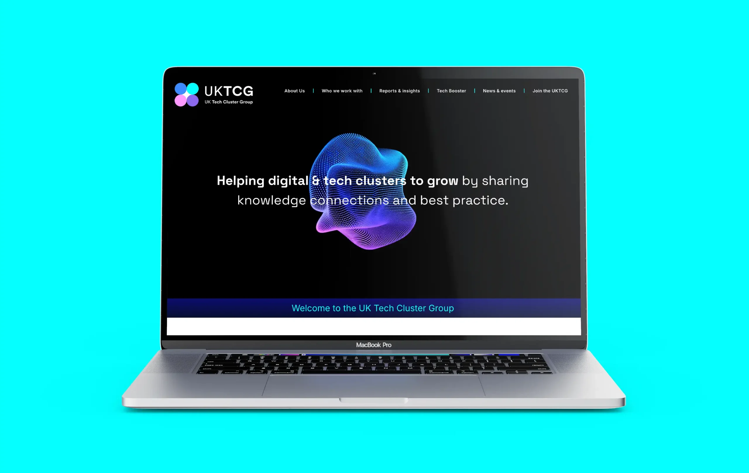
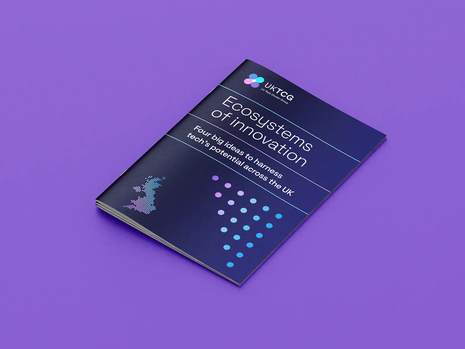
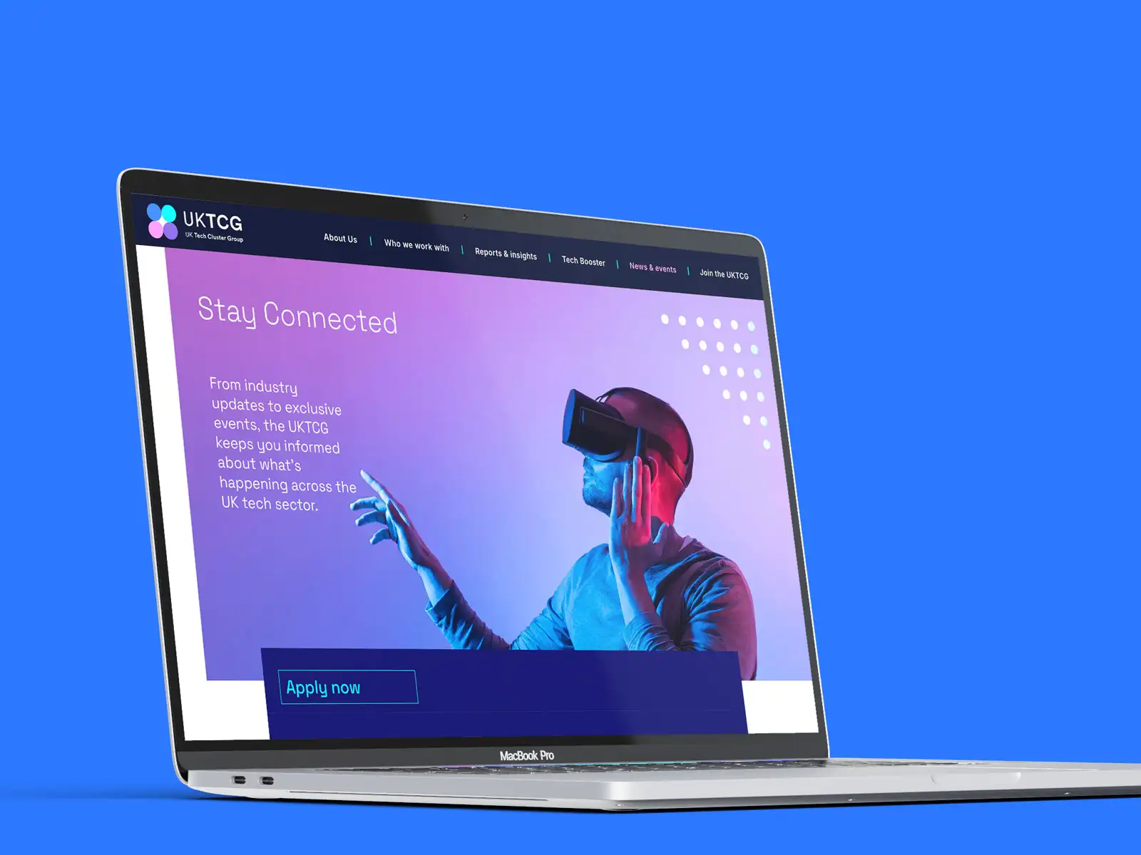
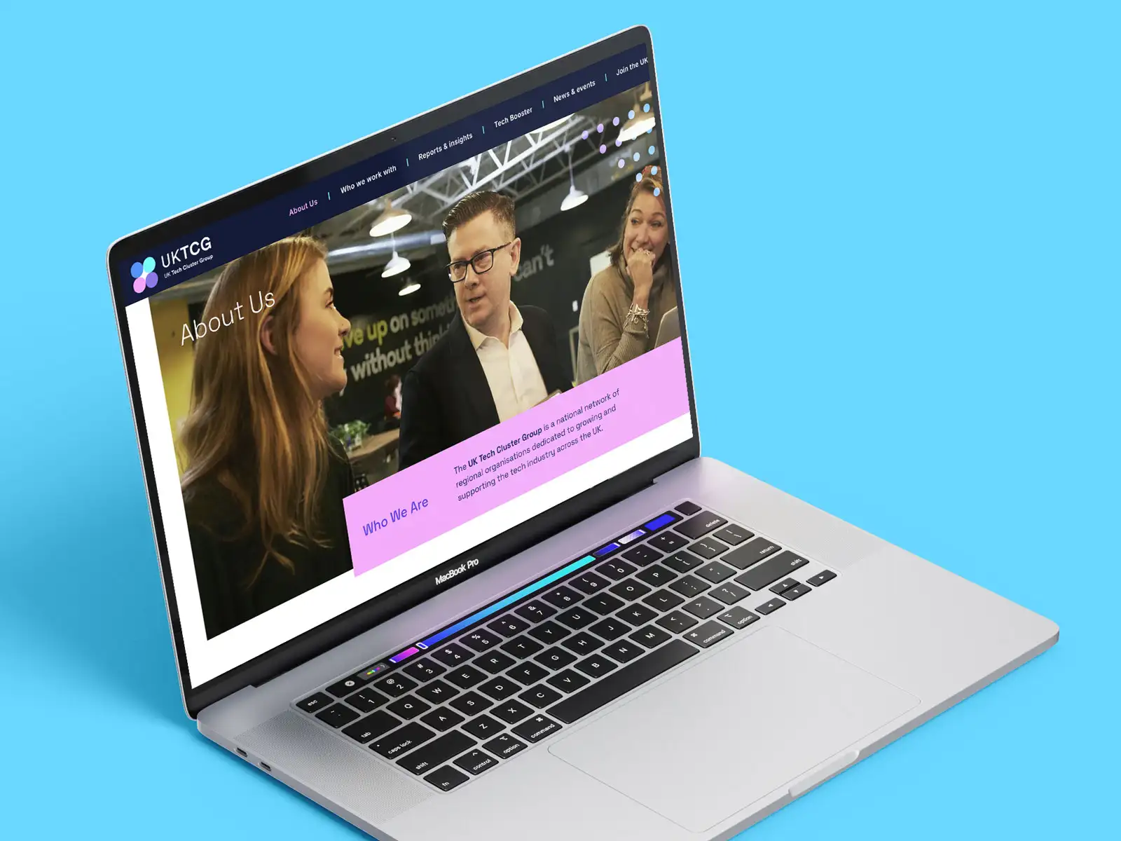
The refreshed UK Tech Cluster group brand mark and identity is a simple cluster based graphic representing the four key priorities of the UKTCG ethos. These areas are Ecosystem Growth, Collaboration, Inclusion and Policy Influence.
This mark is simple and direct in its approach. When these four elements are overlaid together they create a ‘sweet spot’ focussed central area.
This brand utilises a ‘digital first’ brand palette, containing a striking, modern selection of colours. These colour hues represent this forward thinking collaborative approach to championing digital UK growth.
The brand is complimented by a series of cluster icon graphics to help direct the user and identify key brand areas.
The new UK Tech Cluster Group website has been designed to be clear, bright and informative with ease of navigation through simplicity of layout. The landing page consists of a brightly coloured hero graphic cluster which moves and flows together in unison.
The site is highly pictorial to showcase information. With sections edited down into simple understandable blocks with a redefined menu structure. The website has also been optimised to be mobile friendly and show an improvement in SEO.