Brand identity re-fresh. Logo, website, digital brand pack and newspaper for Step Up MCR – the place based giving charity for Manchester.
Step Up MCR was launched in 2019 and after a period of collaborative place partnership had outgrown its current branding look and website. The charity was aware that it needed a new fresh, bold visual outlook to reflect where the organisation was heading. Their challenge was to project their current expansion to reach more people, make connections and achieve additional donation funding.
Working alongside the leading charity focussed PR agency Highrise Communications to help rebrand and repoint Step Up MCR – the place based giving charity for Manchester.
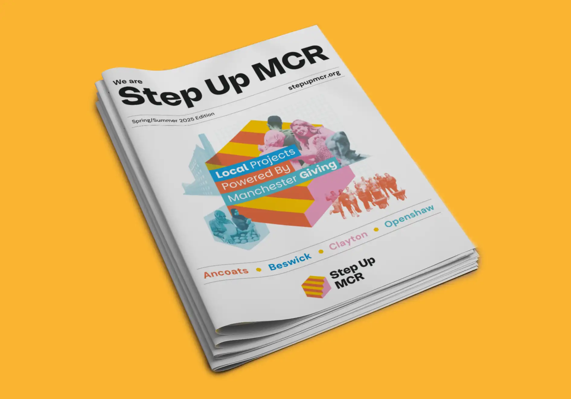
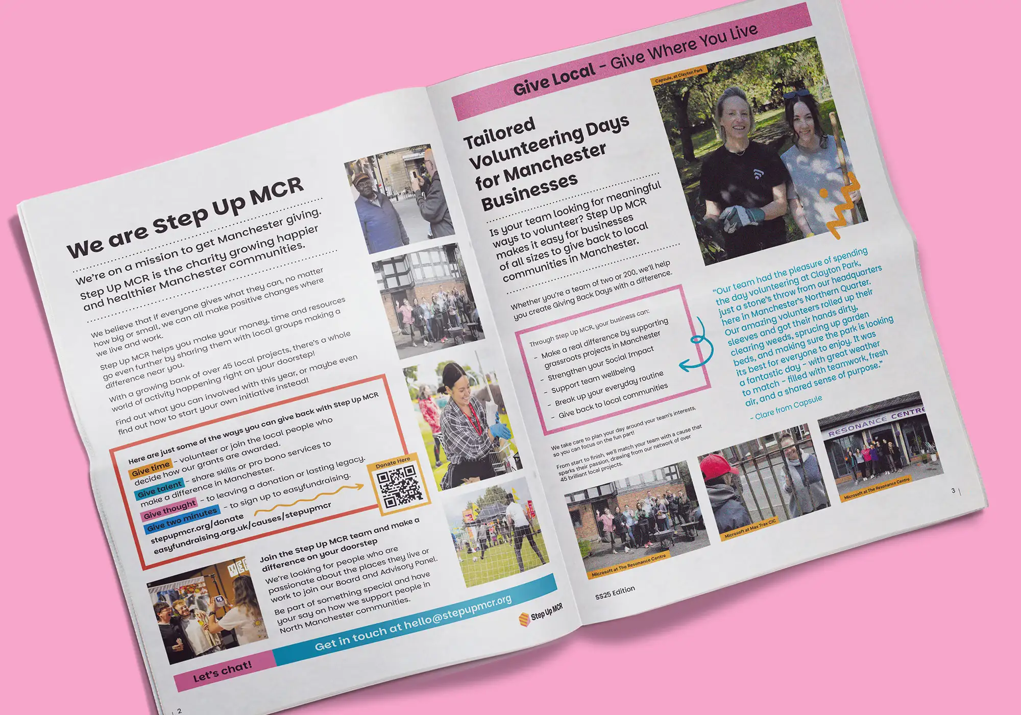
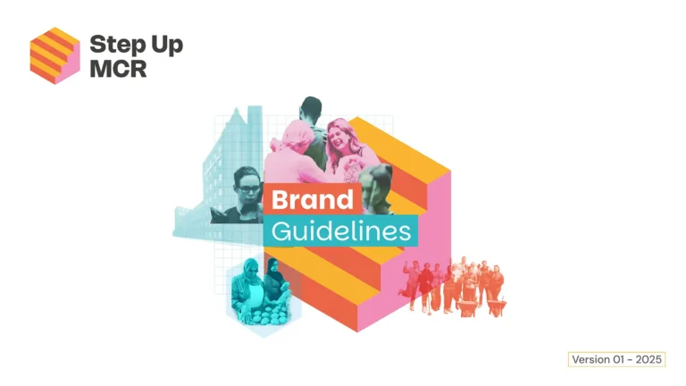
The new rebrand consisted of a logo re-fresh, redeveloped brand identity and guidelines, new custom built website with CMS, digital assets, illustration and printed newspaper.
Once completed, a digital brand asset pack was also created in Canva containing ‘on-brand- templates and guides for the in-house team to create and produce their own assets and deliverables.
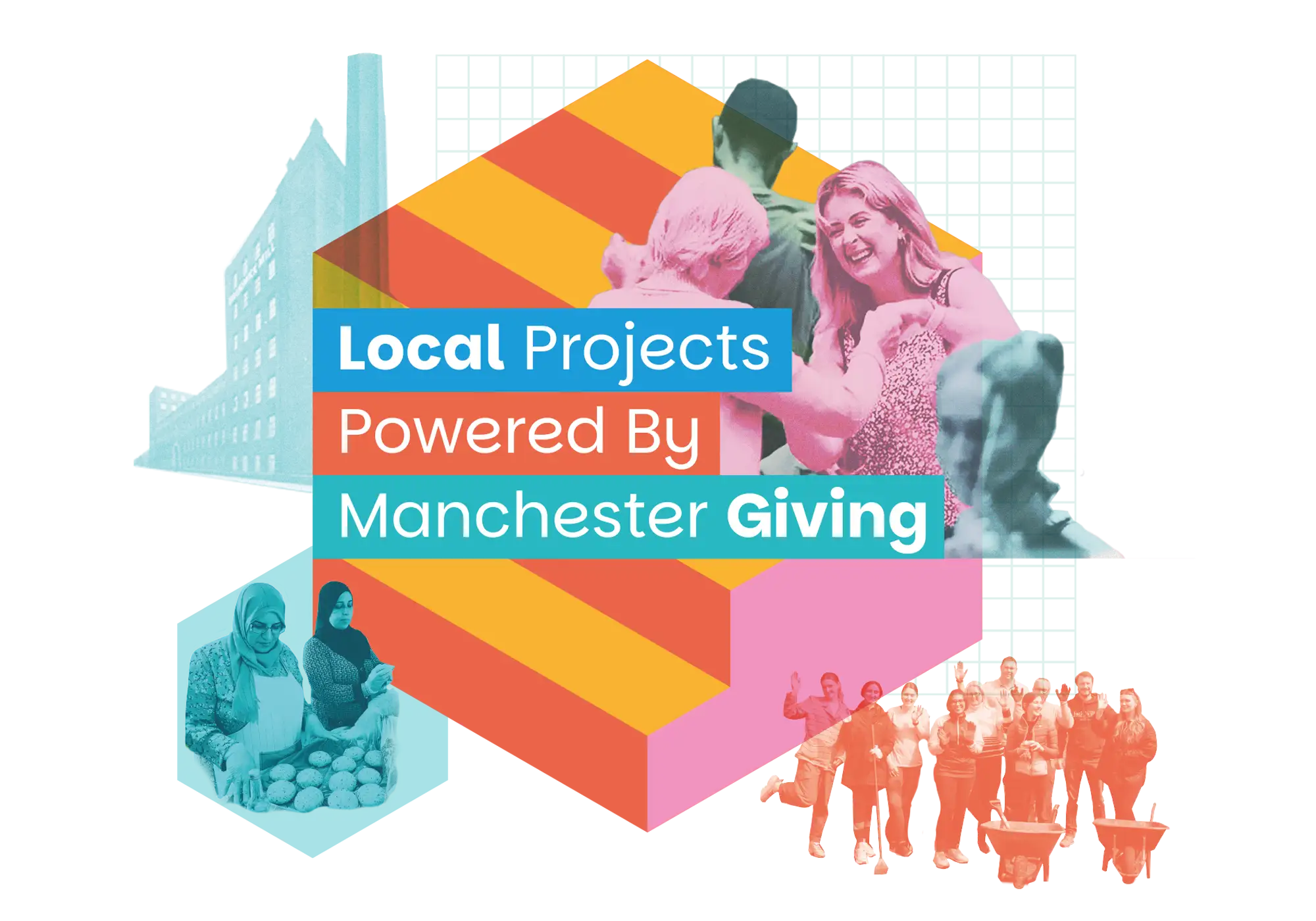
Brand and logo design – Rip it down and start again?
As part of the rebrand process it can be tempting to rip all down and start a fresh. But as Step Up MCR was established in the Manchester area, for the logo refresh, it made for a better brand strategy to repoint, expand and build upon the existing identity for this Manchester charity.
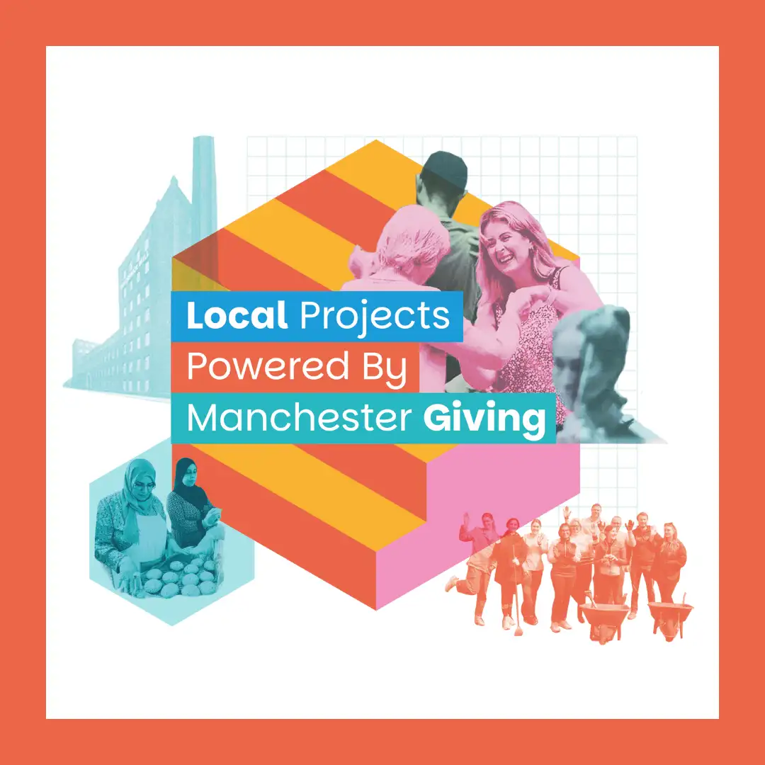
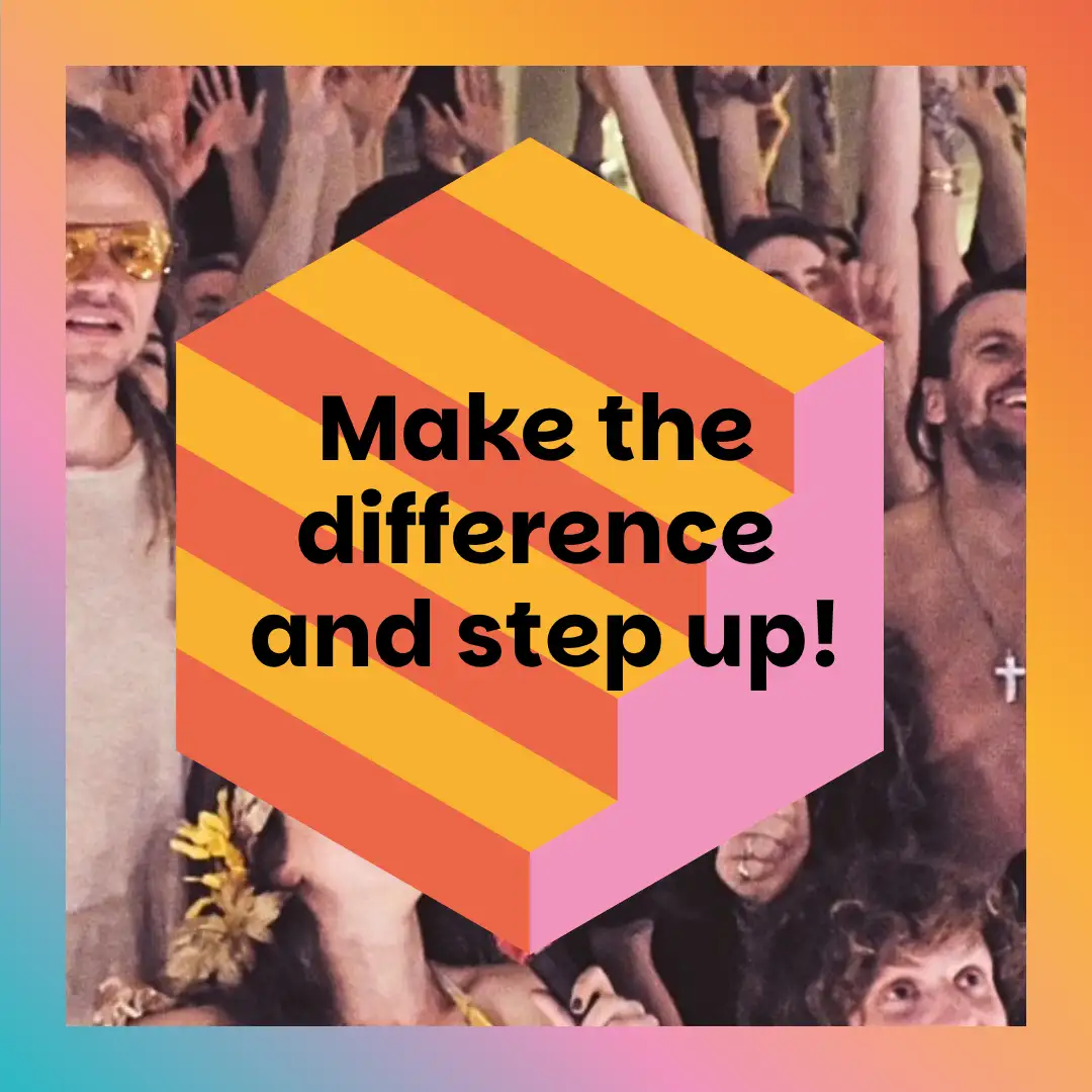
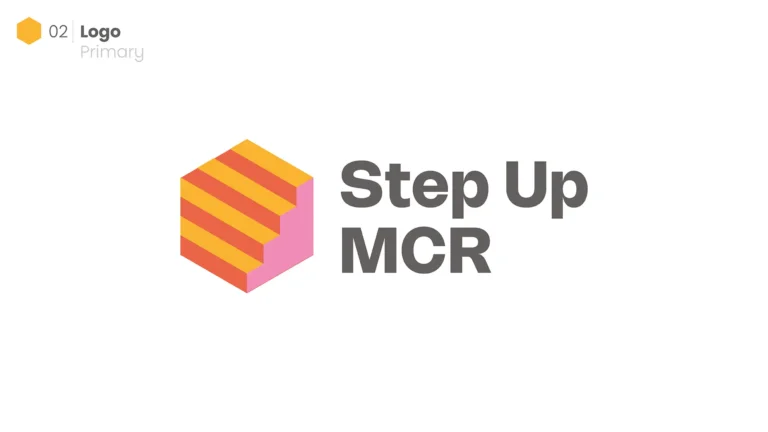
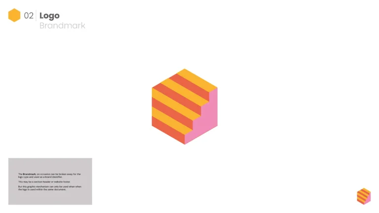
The logo mechanism structure itself was brought back and simplified. The hexagonal structuring was kept and still shows the original bottom step iconography but losing the excess bordering and upper steps.
This gives the logo a more contemporary forward thinking feel and is bold in its approach – but also retains the existing brand ethos structure.
By adding additional colour it also helped move away from any ‘Manchester Bee’ connotations which have become ubiquitous over recent years.
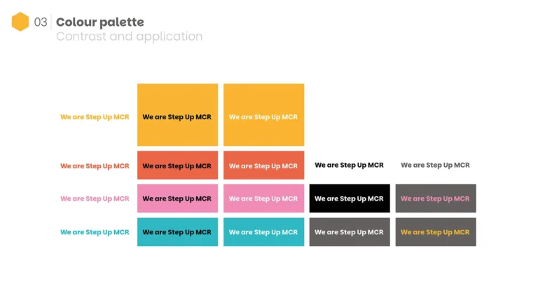
Colour palette
The current brand palette consisted of a bright yellow and grey duotone, with project image photography saved as mono. This worked extremely well, but when applied over a number of pages or applications it was difficult to differentiate its offerings and created a certain visual ‘samey-ness’ . Black and white imagery also dulled and flattened off the vibrant projects and people that Step Up MCR partner with making the visual storytelling process difficult.
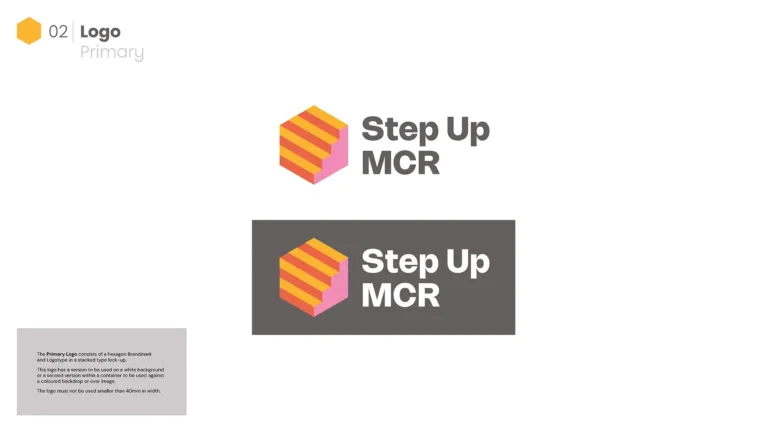
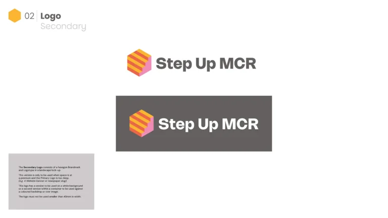
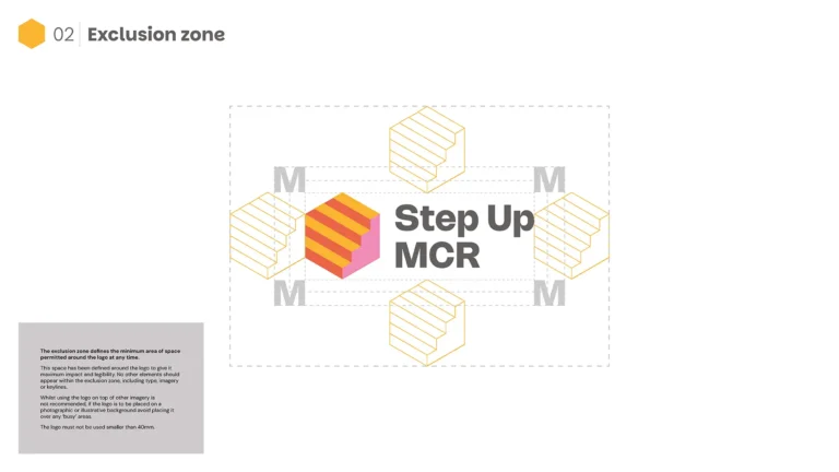
The logo was also made responsive, meaning this could adapt or stack to suit any application. Digital, social and print applications vary so much nowadays and this ensures the logo keep its clarity at all times.
The logo mark and logo type can also be separated as needed too. The logotype itself was also bolstered by a more impactful font.
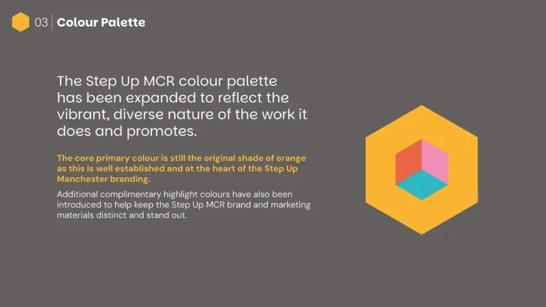
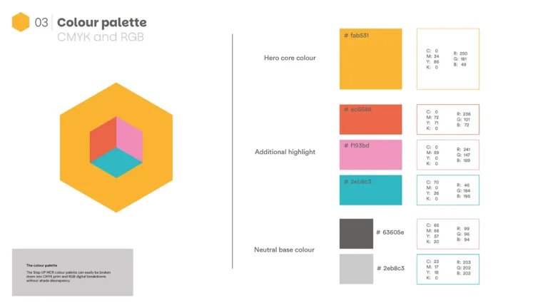
The new brand palette built, on the existing yellow as its base hero colour, also introduces an additional selection of four eye-catching sub colours to work alongside. The dark greys then became neutral base colours to underpin and lift this new palette.
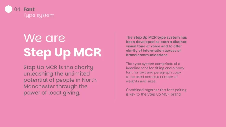
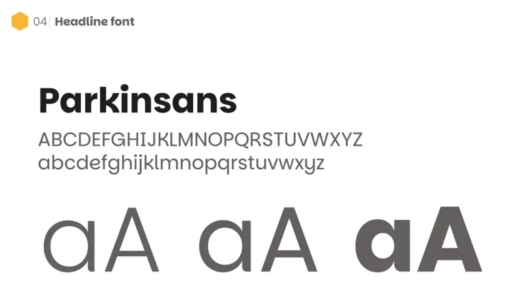
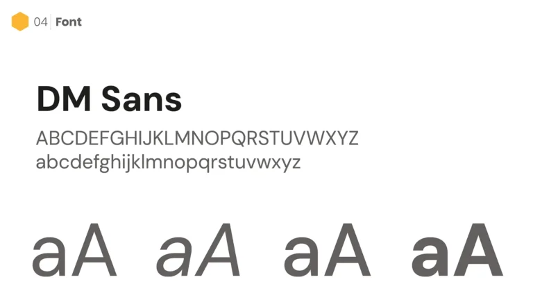
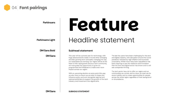
A separate font pairing system was created to allow balanced and interesting type layout structures consisting of two fonts of various weights. A characterful new headline font, complimented with a hardworking body text font.
Existing logo
Logo mark simplification
Reworked logo
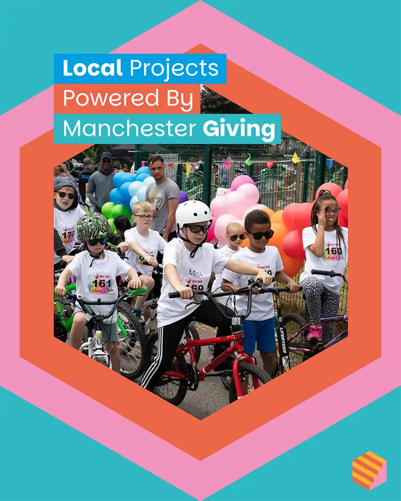
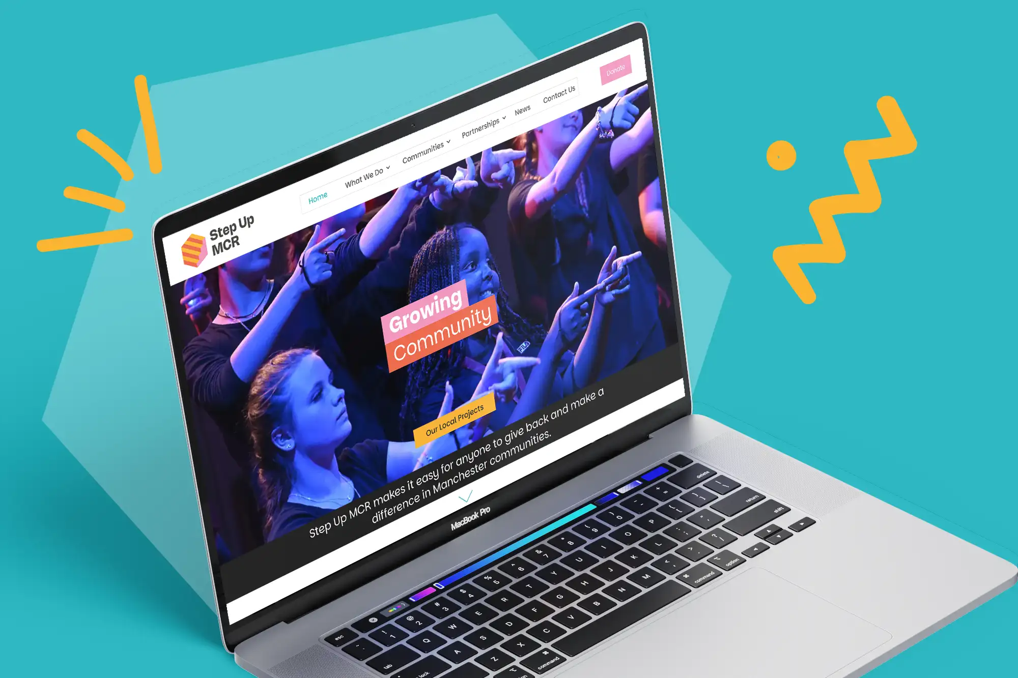
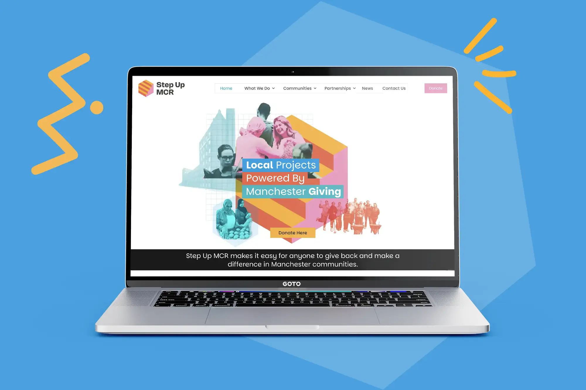
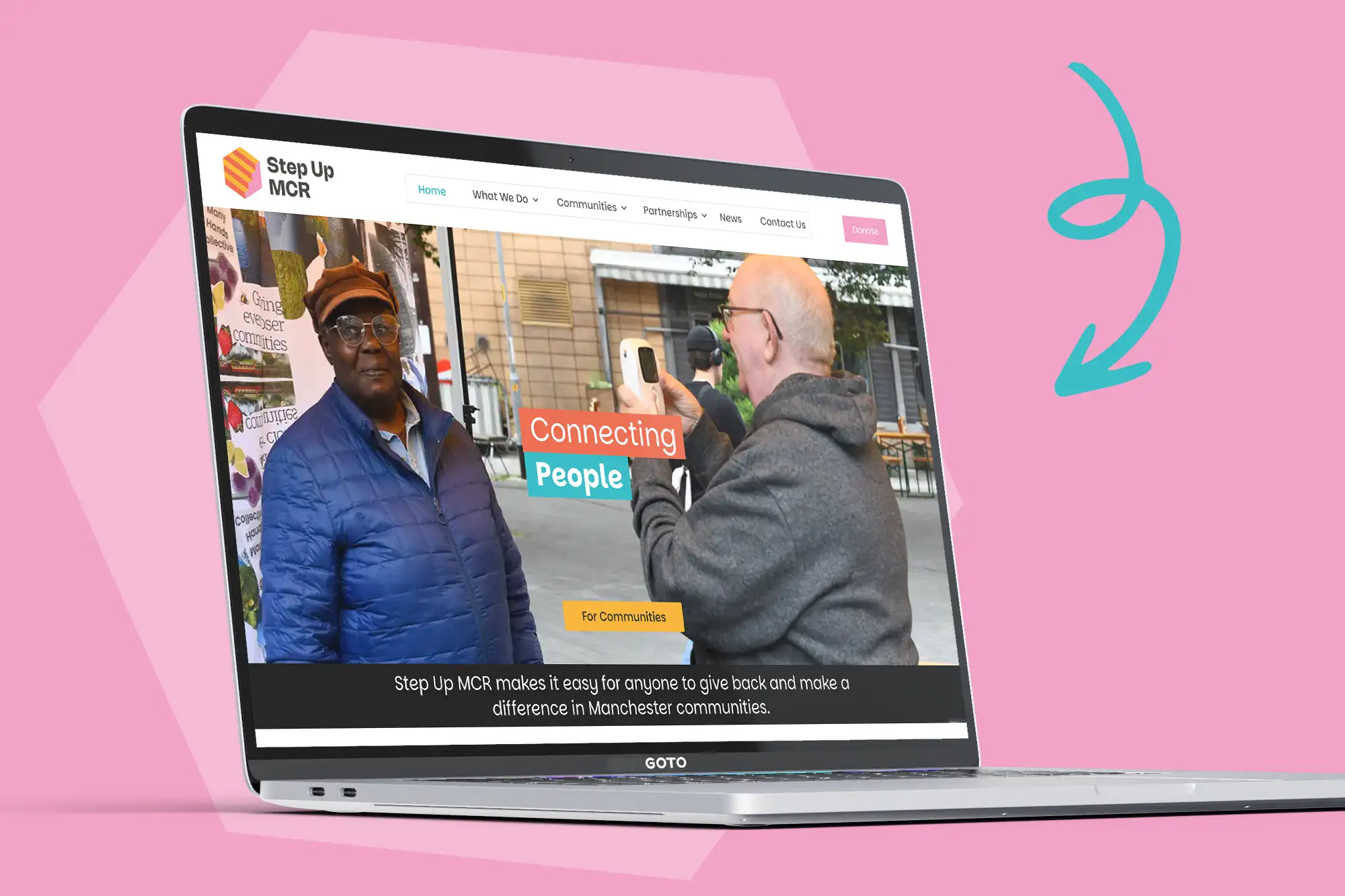
An exciting new website design and build for this fantastic Manchester charity
The new website for Step Up MCR was built using the newly created brand assets. The new website was designed to be more user friendly with custom break points for devices, a better user defined journey with ease of navigation, optimised for seo and designed with disability and access in mind.
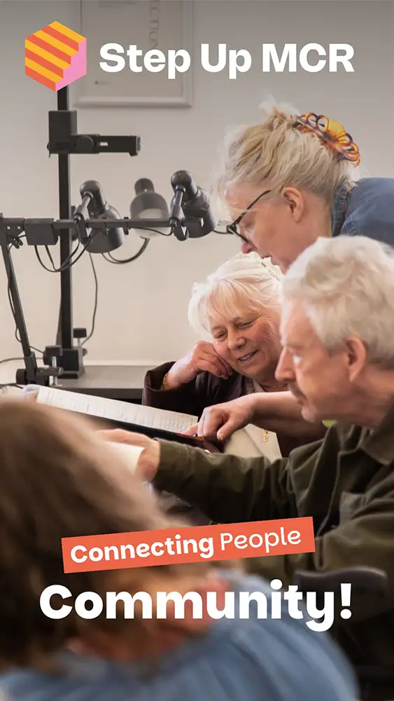
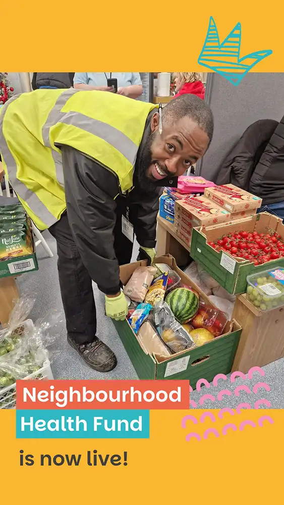
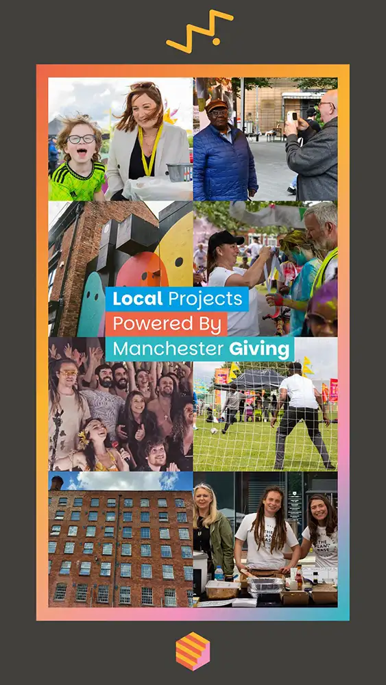
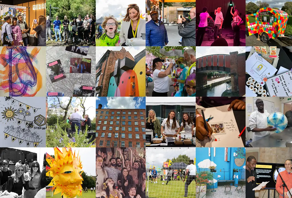
The website is bright, clear and fun its approach, heavily showcasing the exciting projects and teams that work alongside Step Up MCR. The site is highly pictorial to fully convey the breadth and variety of projects undertaken.
The website has been put together in such away that it can be easily updated and maintained by the in-house team.
Result. A unified, engaging brand identity with a purpose-driven website.
Outcome. Help position Step Up MCR as a leading charity in Greater Manchester.
We have received overwhelmingly positive feedback from the Step Up MCR team who are delighted with their revised branding and online presence and confident the professional, yet fun design effectively communicates their values to their community.
Strong communication throughout the project enabled us to collaborate closely with Step Up MCR and gain a deep insight and understanding of the local projects that are at the heart of the organisation. This insight formed a design strategy that keeps those community projects front and centre.
“Our design ethos centres on the application of sustainable drainage principles, optimising opportunities to increase biodiversity and the design of therapeutic landscapes”