Kazky means ‘stories’ in Ukrainian and stories are at the heart of what they do whether it be evaluation, research, consultation, or working with collections.
Kazky were in the position that they were expanding.They had out grown their original Kevinjbolton Ltd trading name and now looking to develop further with a cohesive new brand name and look.
The aim of this branding exercise was to help clarify Kazky’s knowledge and expertise in the Archives, Library and Heritage Consultancy sector.
Initially, the brief from Kazky was to create a standard logotype and various applications and ideas were laid down and sketched out.
As part of this process the logo was rendered in uppercase showing its most basic stripped back form font structure.
The thing that struck home here was the characters used in the company name had no roundels in the bowl, shoulder or eye of this font and was made entirely of angled or straight parallel width stems and bars.
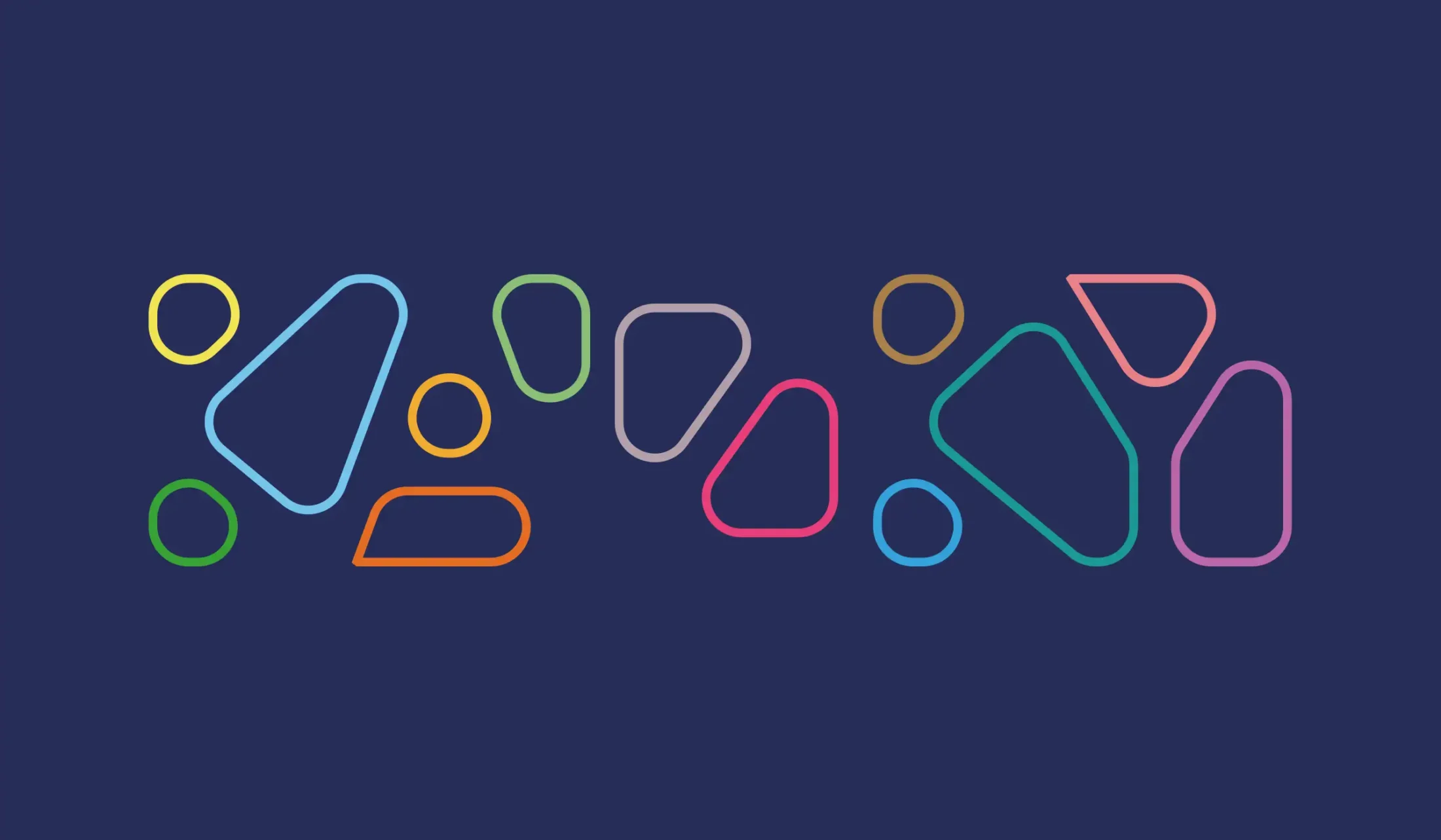
Although initially quite stark in appearance, when a boxline frame was added this created fantastic angular shard sections.
These elements could be individually coloured and highlighted almost like stained glass.
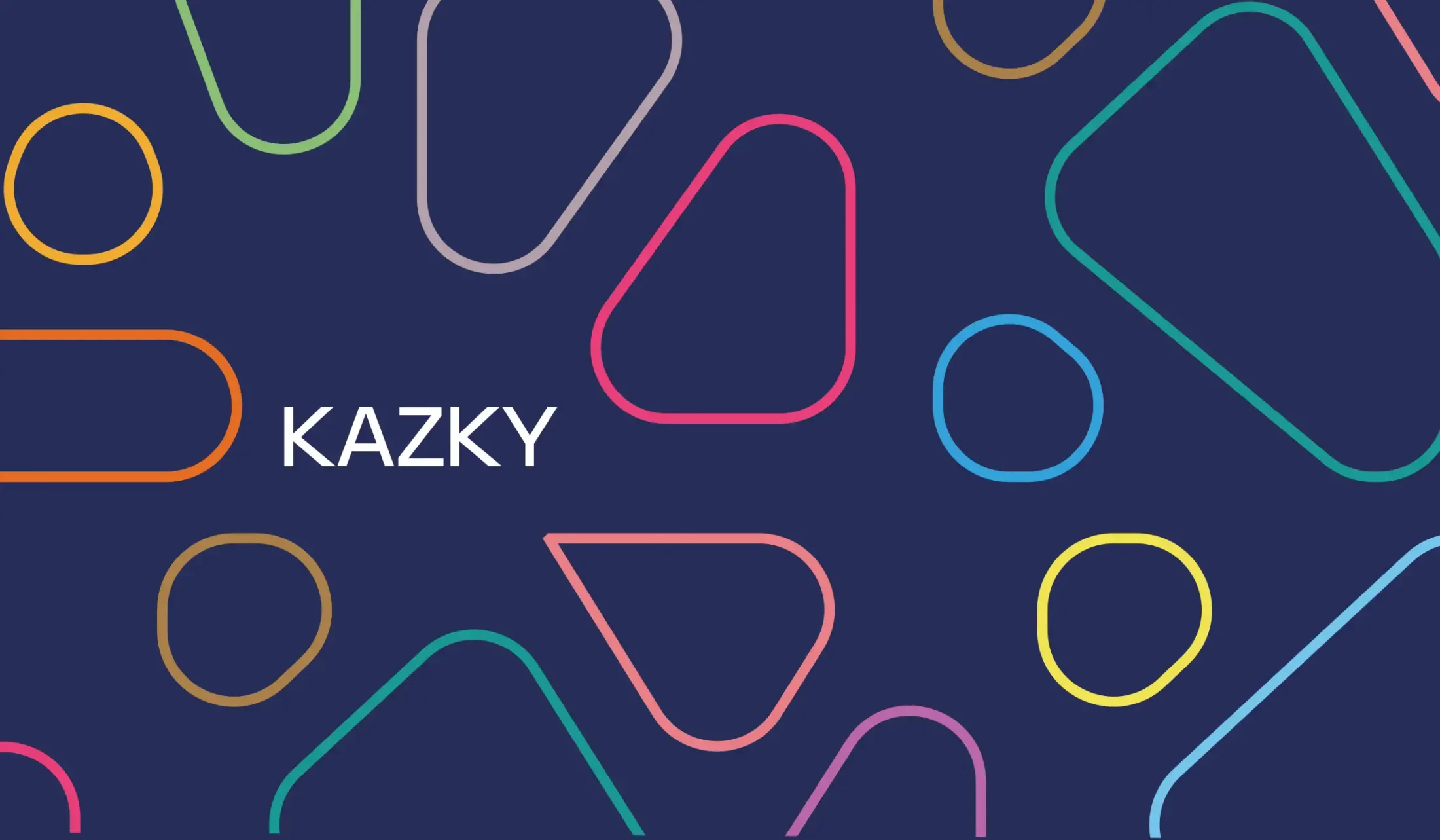
Then, what if these sharp sectional elements were softened and rounded somehow. Then used an element to balance against the actual logo itself?
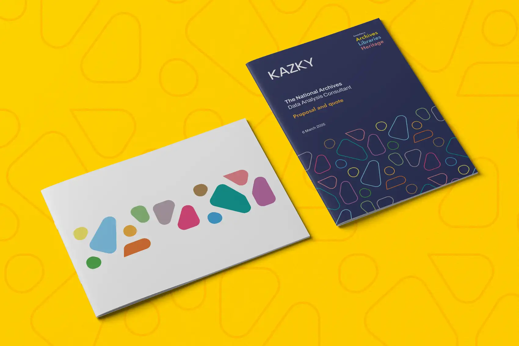
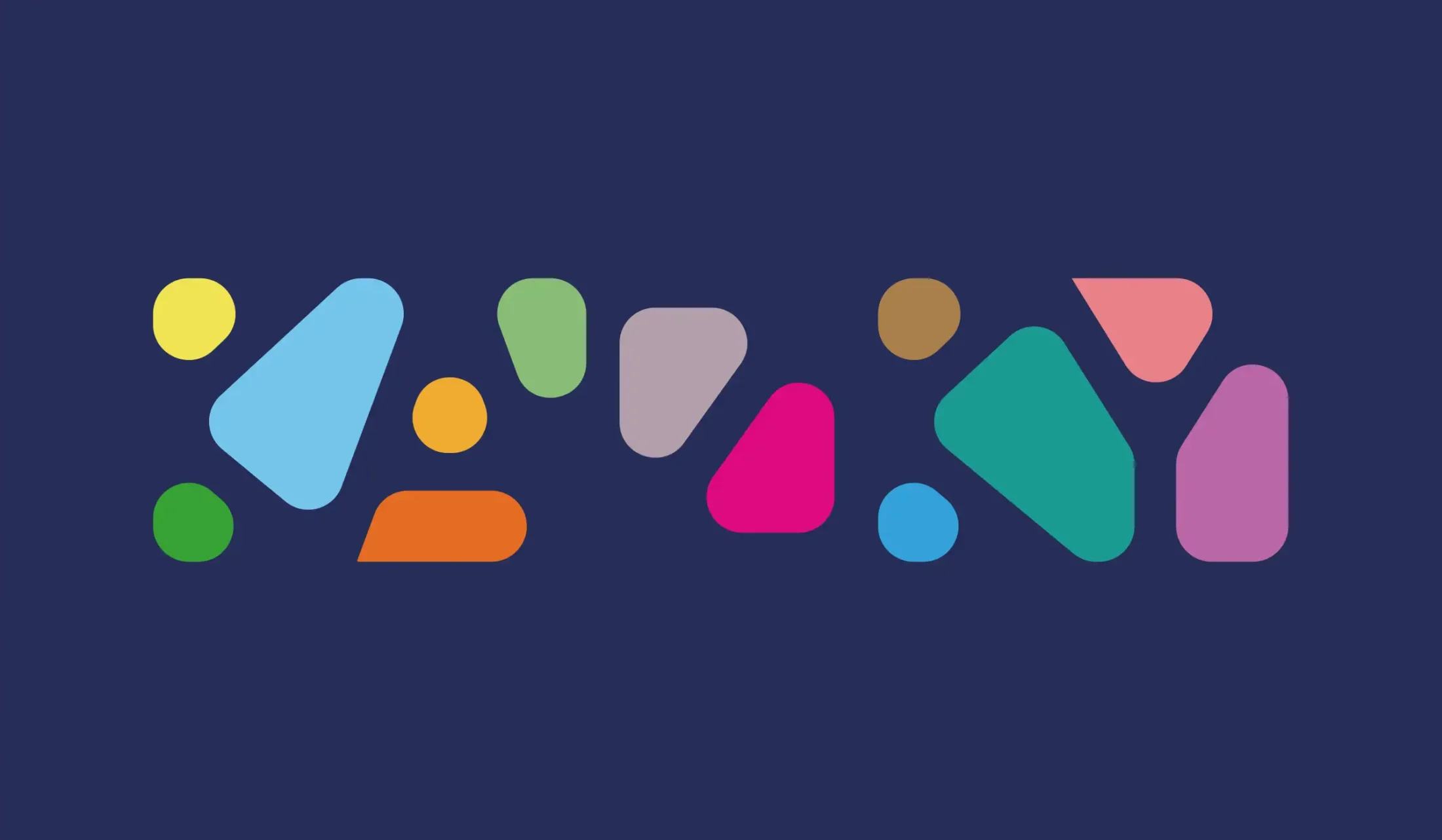
This was then deconstructed and we broke this down and simplified this even further. Creating abstract patterns and shapes. It did still spell out Kazky if you started hard enough – but now it took on a new relevance.
Then next step was to take this graphic and step it up into a tiled masonry pattern. A logo no more, this now took on a life and identity of its of it’s own. The elements and shapes with their imperfect angles and spacing between each creating a natural humanist storytelling pattern.
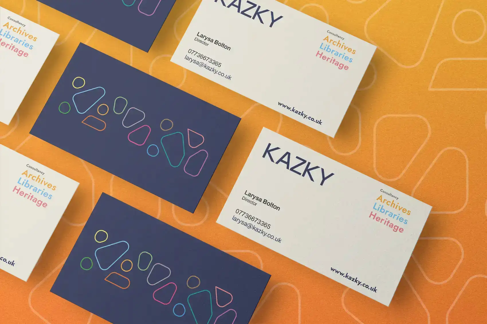
This pattern is used alongside the original logotype as a holding mechanism and applied across covers or used on its own a visual background texture.
"Deconstructed and sectioned logotype is broken down and simplified to create an abstract stylised shape mechanism."
Result. A cohesive brand identity with an interesting, engaging appeal.
Outcome. Help position Kazky as a leading Consultancy for Archives, Libraries & Heritage.
We have worked with Gary Smith of GOTO Creative in Stockport to create a new logo and brand. Gary created the Archives+ logo back in 2013 and it has been great to link up with him again, although having a logo feels very grown-up!