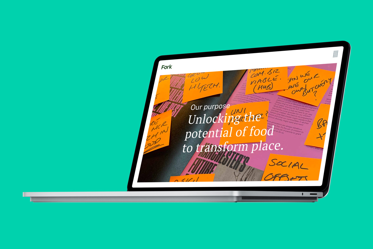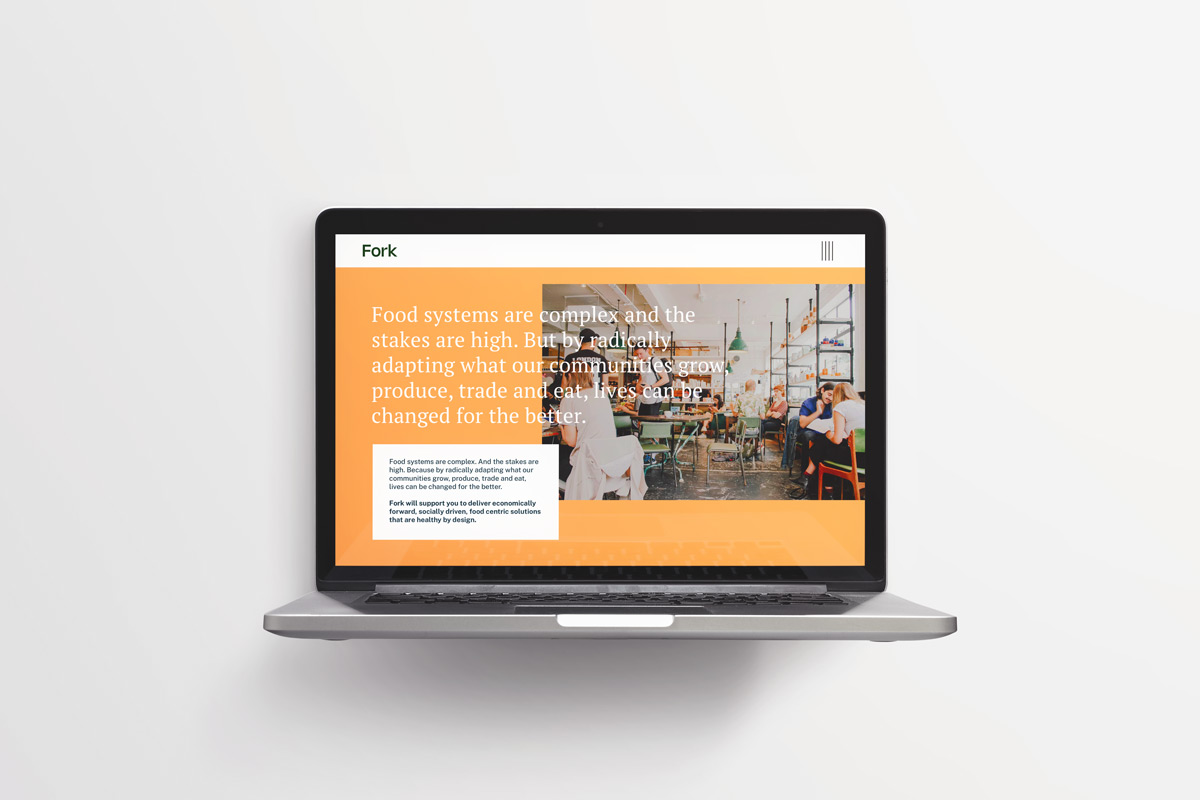

A bold clarity was the key here for the brand identity to get across such complex and diverse subject matters. This could then be used to present detailed study areas in a clear informative manner that would be easier for users to absorb and make valued decisions.
As part of the brand strategy; it was decided that this clarity be reflected in a strong logo-type structure without any excess fluff that emphasises a strong bold and trusted presence with a knowledgable base. This is then complimented with the addition of both a brand mark identifier and styled iconography. Which when combined together with imagery and a food systems colour palette would create a distinct brand.
The word ‘Fork’ was crafted with an almost architectural style sans font with characterful flourishes; denoting its strength, trust and confidence.
The logo-type is complimented by a deconstructed fork motif. This mark uses negative space to create the visual prongs which are then colour sectioned for each of the four core service areas. This graphic mark is used both with the logo-type and separately as a brand identifier to be used to section and drive through the pages.
A natural modern earth-tone food systems palette was created to represent positive outcomes of the key areas.
In addition, stylised contemporary graphic icons were created to represent Placemaking, Impact investment, Technical guidance, Policy and partnerships.


The website itself was designed and built in such a way as to clearly explain the wide and interesting areas that a food systems consultancy covers. It then puts across their brand vision and the end outcomes they wish to resolve.
Also, it is a showcase for itemised case studies telling the type of detailed work they have been involved in and completed.
At Fork, we are on a mission to adapt how we grow, produce, trade, and consume food. Food isn’t just sustenance—it’s a force that connects people, builds prosperity, enhances sustainability, and promotes health. Fork delivers economically forward, socially driven, and healthy-by-design solutions. Our bespoke services span placemaking, impact investment, technical guidance, and policy formulation. Led by Jemma Hynes, founder of FoodSync CIC, our team catalyzes positive transformations in food systems.
With expertise in regeneration, economic development, food technology, and policy, we are reshaping the future of food and places. Join us in making a difference.
Website copywriting by Isla McGuckin
Jemma Hynes,
Strategic Director, Fork

GOTO Creative Ltd.
Merchants House. Market Place. Stockport, SK1 1EU
0161 474 8109